This University of Michigan professor created some election maps that actually make sense

Audio By Carbonatix
[
          {
            "name": "GPT - Leaderboard - Inline - Content",
            "component": "35519556",
            "insertPoint": "5th",
            "startingPoint": "3",
            "requiredCountToDisplay": "3",
            "maxInsertions": 100,

            "adList": [
              {
                "adPreset": "LeaderboardInline"
              }
            ]
          }

        ]
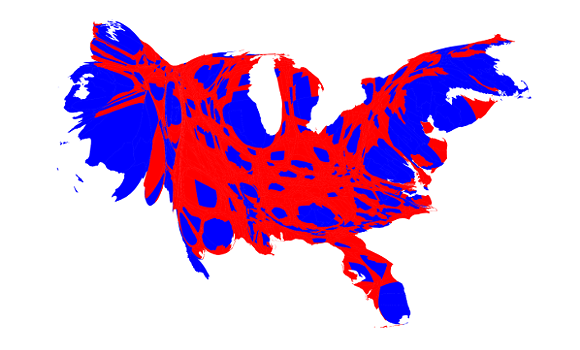
The result is a dysmorphic representation of our country that tells a clearer story about how we voted and it makes a heck of a lot more sense than a map that simply blocks each state out in red or blue.
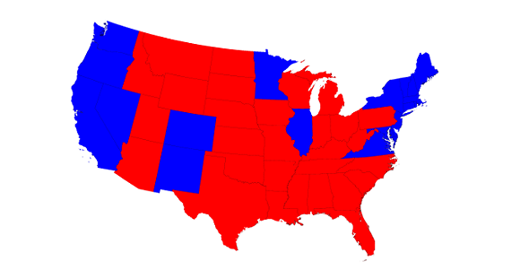
Here's a traditional election map:
The map below is called a cartogram and it does a couple things — first, it enlarges smaller states with bigger populations to better reflect the number of voters in those states. Then, he ditched the idea that only two colors can represent the way people voted and instead instituted the use of red, blue, and shades of purple. This is the result:
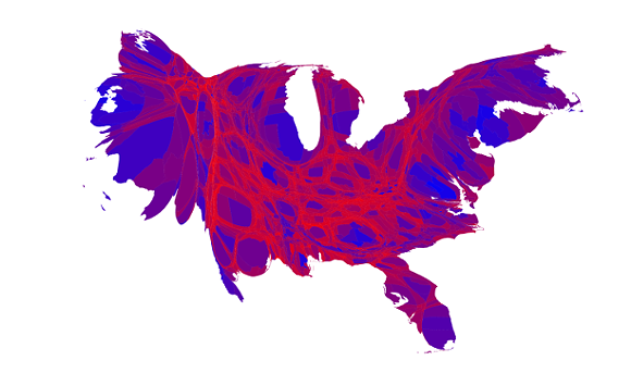
If you want to read the breakdown Newman's map, you can click here.