Audio By Carbonatix
[
          {
            "name": "GPT - Leaderboard - Inline - Content",
            "component": "35519556",
            "insertPoint": "5th",
            "startingPoint": "3",
            "requiredCountToDisplay": "3",
            "maxInsertions": 100,

            "adList": [
              {
                "adPreset": "LeaderboardInline"
              }
            ]
          }

        ]
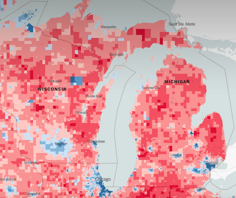
Screengrab via New York Times
As we all damn well know by now, Donald Trump scrounged up nearly 11,000 more votes in Michigan in 2016 than Hillary Clinton, helping him win the presidency. But where exactly did those votes come from?
A detailed, interactive map released today by The New York Times paints the clearest picture of 2016 yet, giving readers a neighborhood-by-neighborhood breakdown. The map was created by Washington State University doctoral student Ryne Rohla, who compiled the data from more than 168,000 voting precincts, drawing data from government websites and election officials.
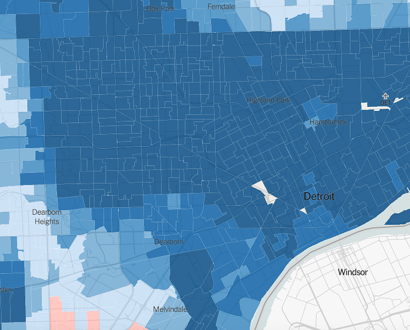
Screengrab via New York Times
While much offered here is common knowledge — bigger cities tend to vote Democrat, while rural areas tend to vote Republican — the new map shows just how close the race was in Michigan.
Detroit, which is more than 80 percent black, went solidly to Clinton, showing up as a deep blue. And Ann Arbor, ranked as the most educated city in the nation, also went to Clinton.
But zoom out to the suburbs, and you can see how close the race was. What do the well-to-do Grosse Pointes and hardscrabble Downriver have in common? Both were won over by Trump — but not by much, rendered on the map as light pink.
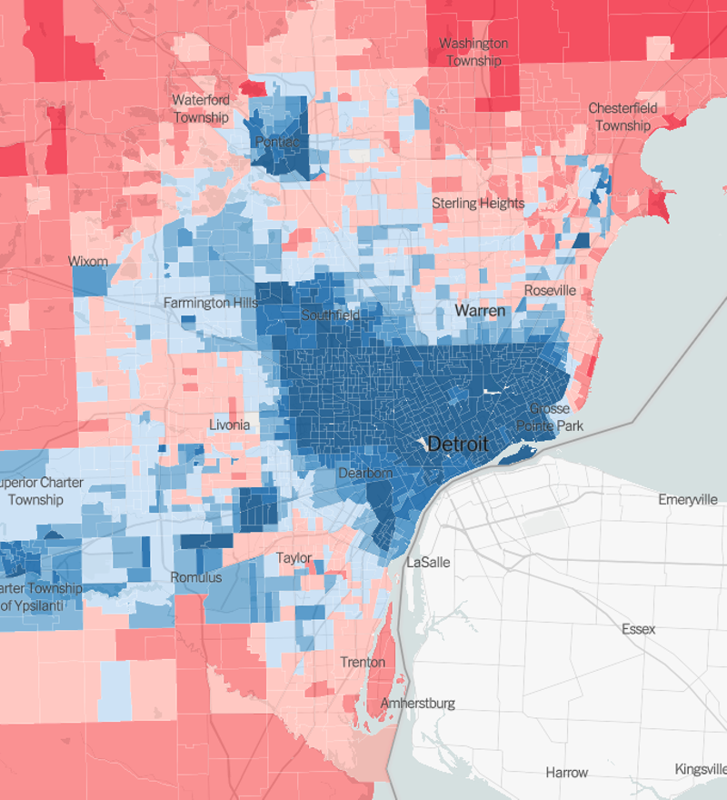
Screengrab via New York Times
It's unlikely the map would look the same if the election were held today: A recent poll found that only 36 percent of registered voters in Michigan approve of Trump.
You can view the map here.
Stay on top of Detroit news and views. Sign up for our weekly issue newsletter delivered each Wednesday.