Audio By Carbonatix
[
          {
            "name": "GPT - Leaderboard - Inline - Content",
            "component": "35519556",
            "insertPoint": "5th",
            "startingPoint": "3",
            "requiredCountToDisplay": "3",
            "maxInsertions": 100,

            "adList": [
              {
                "adPreset": "LeaderboardInline"
              }
            ]
          }

        ]

Detroit Pistons
The new Pistons logo that the team's chief marketing officer says "celebrates the club’s long-standing history."
After a six-month design collaboration with the NBA and Nike, the Pistons have released a new logo that they'll take with them downtown to the Little Caesars Arena, and we can't really tell what's new about it.
The revamped logo looks almost identical to the logo the team rocked in the '80s and '90s during the Bad Boy era. But a press release from the Pistons organization makes clear that this is a modern version of the throw-back logo. The updates include "sleek, accurate groove lines, a bold team uniform font and the addition of a chrome outline."
When stacked on top of one another, you can start to make out the differences between the logos:
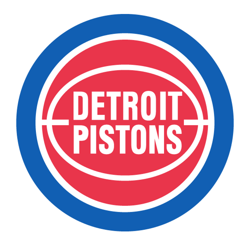
That seems like a pretty fancy way to dress up a chrome rim and new font, but we see you, Pistons.
At the very least, the new (and old) minimalist look is certainly an improvement over the word art monstrosity that reigned for the past dozen years: