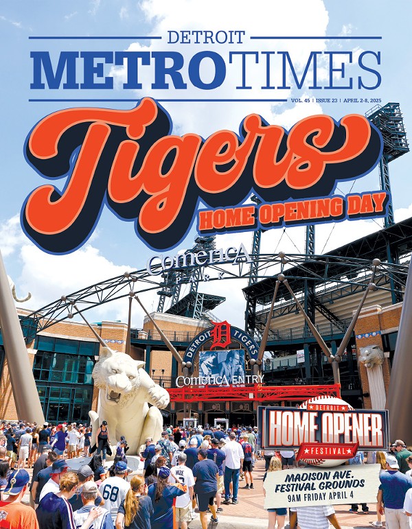
Chicago isn't the C. Bostonians don't live in the B. And if you're in Philly, nobody's gonna welcome you to the P.
Yet it has become an affectionate nickname for the city of Detroit. And, whether you love it, hate it, or begrudgingly ignore it, the D, as in the very letter, has represented the city for more than a century.
And professional baseball has everything — and nothing — to do with it.
Tom Stanton is an author and professor of journalism at the University of Detroit Mercy. He won the Michigan Author of the Year Award in 2008 for Ty and the Babe, and before that he wrote a compelling memoir about Tiger Stadium entitled The Final Season.
"The Tigers first put a D on their logo in 1903, but it was more of a block letter font. The first version of the old English D was unveiled the year after, in 1904," Stanton says. "We've seen it change slightly over the decades, but the version that we have today, on hats and home uniforms, hasn't really changed since 1961."
But he adds that the D we see today, on hats, shirts, stickers and tattoos, has become globally distinctive of Detroit and Detroiters.
Stanton pointed us to the state's west side, to Muskegon, home base of Marc Okkonen, the authority on the lineage of the Detroit Tigers' internationally recognized logo, and every other professional baseball team's uniform.
An author of several baseball books, Okkonen's greatest accomplishment was compiling and penning the mammoth reference guide Baseball Uniforms of the 20th Century: The Official Major League Baseball Guide. Endorsed by Major League Baseball and the Baseball Hall of Fame, he researched more than 3,500 uniforms.
Overwhelming — and almost as heavy as Prince Fielder — it's a full-color encyclopedia that explains in detail more than 90 years of major league baseball uniforms; it's the only complete and authentic uniform history of every single major league franchise from inception to 1993.
"As far as team logos go, the Detroit D is right up there with the Yankees," Okkonen says. "Actually, it's more bold than the Yankees. It really stands out."
He notes that if you look at the D from 1908, 1930 and the current rendition, "You won't really see much difference. The Tigers' old English D logo "enjoys the longest continuous usage of any major league uniform insignia."
Okkonen, who knows a thing or two about age, says "When you live with something for a hundred years, it becomes part of your DNA. I can see how the city of Detroit adopted the Detroit Tigers D as its own."
Sam Wolf is a renowned tattoo artist who works out of Signature Tattoo, in Ferndale.
"The D? It's the Detroit brand," he says. "At this point, I think it has little to do with baseball."
He's permanently etched the old English D on myriad customers. Hundreds maybe. And he sees no correlation between the season and the number — or kind — of people coming in. No barrier to age or race, and there's no uptick around Opening Day.
"I've tattooed the D on middle-aged moms and skinny lil' hipster kids, punks and metalheads," Wolf says. "There was a businesswoman who travels all around the country for work and gets tattoos of the places she spends serious time in and likes the most. She wanted a happy face with a bullet in its forehead and the Detroit Tigers D on its cheek."
"I've done the Tigers D in negative space, blue ink fading to orange, a metallic look, red, black and outline only," he says. "We keep a whole set of old English D styles on file."
Wolf himself doesn't have a D tat, but he says he never tires of putting it on other people.
"It's a point of pride," he says. "The D is a symbol. You can go all over the world and when you see that old English D, whether it's on a shirt, hat or a tattoo, you don't know that they're some huge Tigers fan, but you know they have Detroit roots."
Artist Neil O'Malley ruminates on the D
I feel like the D is so well-respected because it sort of represents everything about Detroit without any bad connotations attached to it. The D is in old English or "Cloister" font, which is "old" like most things in Detroit, but it's not corrupted or in ruin. It has ascended from the Tigers and is not really as intimate with them anymore. The D is still the symbol for the Tigers but it is the symbol for the whole of Detroit. It's complicated and hasn't been simplified like most logos have these days, which is a great representative of the intricacies of Detroit via politics, city layout and culture. The D is small and not enlarged to be made more legible on the baseball caps, forcing the viewer to engage with or approach it. Which is something that you have and need to do with the city. But you won't be disappointed if you do engage and participate with the city of Detroit or a Detroiter.
Neil O'Malley works at the letterpress print shop Signal-Return in Eastern Market. Learn more at signalreturnpress.org.


