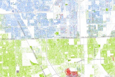
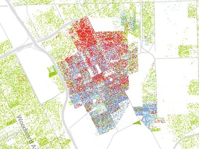
Detail showing Detroit's boundaries on the Racial Dot Map
For readers of Wired, this is damning imagery of our region, showing high levels of segregation.
If you haven't seen the Racial Dot Map, you should probably take a peek. Especially if you're a map nerd.
The map was created by Dustin Cable at University of Virginia's Weldon Cooper Center for Public Service. Wired Magazine called it "the most comprehensive representation of racial distribution in America ever made."
Researchers used data from the 2010 U.S. Census to create a map in which one person is represented by one dot. The dots are color-coded for individual race: Blue for white, green for African-American, red for Asian, orange for Latino, and brown for "other." And there are a lot of dots: 308,745,538 of them. It's worth it to spend a few minutes familiarizing oneself with the racial makeup of the country, as well as its density.
But one thing you notice right away is that broad sections of the American heartland are really, really white and very rural. The most interesting and colorful (literally and figuratively) places are the cities, where many different kinds of people live. And, roving from big city to big city, you begin to see how some cities are more integrated than others. Some have distinct parts of town where racial groups tend to live, while other areas are blurs of multicolored dots.
And then there's Detroit.
The run-down of the piece in Wired magazine uses an image from Detroit that gives the reader pause: It's of Eight Mile Road just east of Woodward, where an ocean of green dots ends sharply at the dividing line, becoming a sea of blue dots north of it. The caption for this image describes Detroit as "among the most segregated cities in America." The image leaves little doubt.
There are some other interesting things to see in the map, noted below.
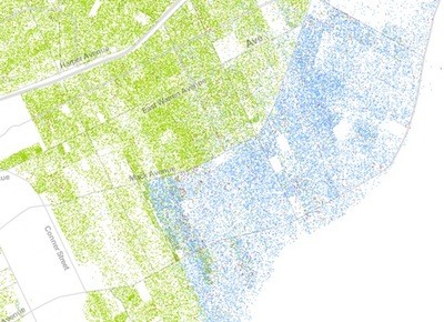
Detail of the Racial Dot Map
Here's a view of Detroit's borders with the Grosse Pointe's, showing racial segregation as stark as along any border.
Detail of the Racial Dot Map
The racial diversity of Hamtramck is clear in this image. Note Detroit's "Banglatown" district from Hamtramck up to the Davison, as opposed to the African-American neighborhood on the west side of Joseph Campau. Also, note the overwhelming density; if Detroit were as dense as Hamtramck, it would have 1.6 million residents.

Detail of the Racial Dot Map
Tricolor west side: The east side of Dearborn, here almost completely in blue, buts up against the city's African-American west side, which blends into the Latino precincts of Mexicantown.
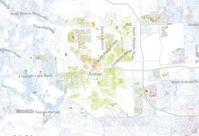
Detail of the Racial Dot Map
Detroit Junior: Though it's less dense and more diverse, Pontiac is a community of color surrounded by overwhelmingly white suburbs.